Designs of the Week
(09 Jan ─ 15 Jan)
by Teodor Moisescu Welcome to the first edition of my favorite designs of the week! Each week, I scour the internet for the most innovative, inspiring and thought-provoking designs out there. This week, I have selected five designs that truly stood out to me for their creativity, originality, and overall impact. From cutting-edge digital art to minimalist print designs, these works showcase the very best of what the design world has to offer. So, without further ado, let's dive in and take a closer look at these amazing designs that have caught my eye this week.
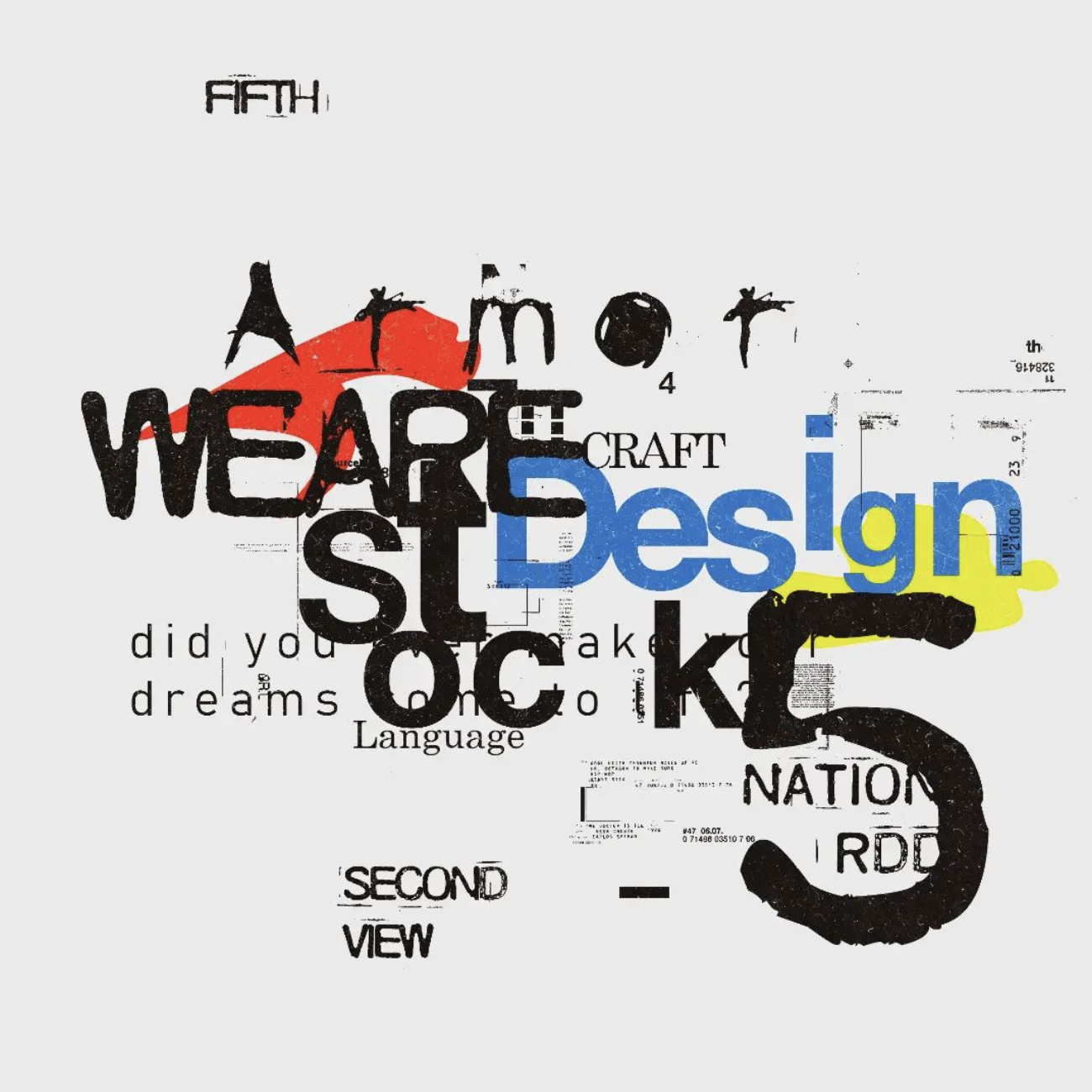
"Design Stock" by @danteatype
Ronald Lubega is a 20-year-old from Uganda, raised in an orphanage. He is a self-taught designer whose works come from deep inside his heart and tell a story about his life experiences. He taught himself design because he wanted to communicate to people, but there are no design schools in Uganda.
When it comes to typography, Roland is a true master of his craft. He has a unique ability to express his emotions and messages through the use of type, and he does so in an incredibly interesting and creative way.
One of Roland's greatest strengths is his use of experimental type. He is not afraid to push the boundaries and try new things, and this is evident in the way he uses type in his designs. For example, he often incorporates unconventional typographic elements, such as distorted letters, hand-drawn type, and unexpected color combinations, to create a sense of movement and energy in his designs.
He is constantly pushing the boundaries of typography, and his designs are a true inspiration to other designers. If you're looking to add a little more creativity and experimentation to your own typography, take a cue from Roland and try out some new and unexpected techniques.
Ronald's story is a testament to the power of creativity and self-expression, and his use of experimental type is a reminder of the endless possibilities that can be achieved through design.
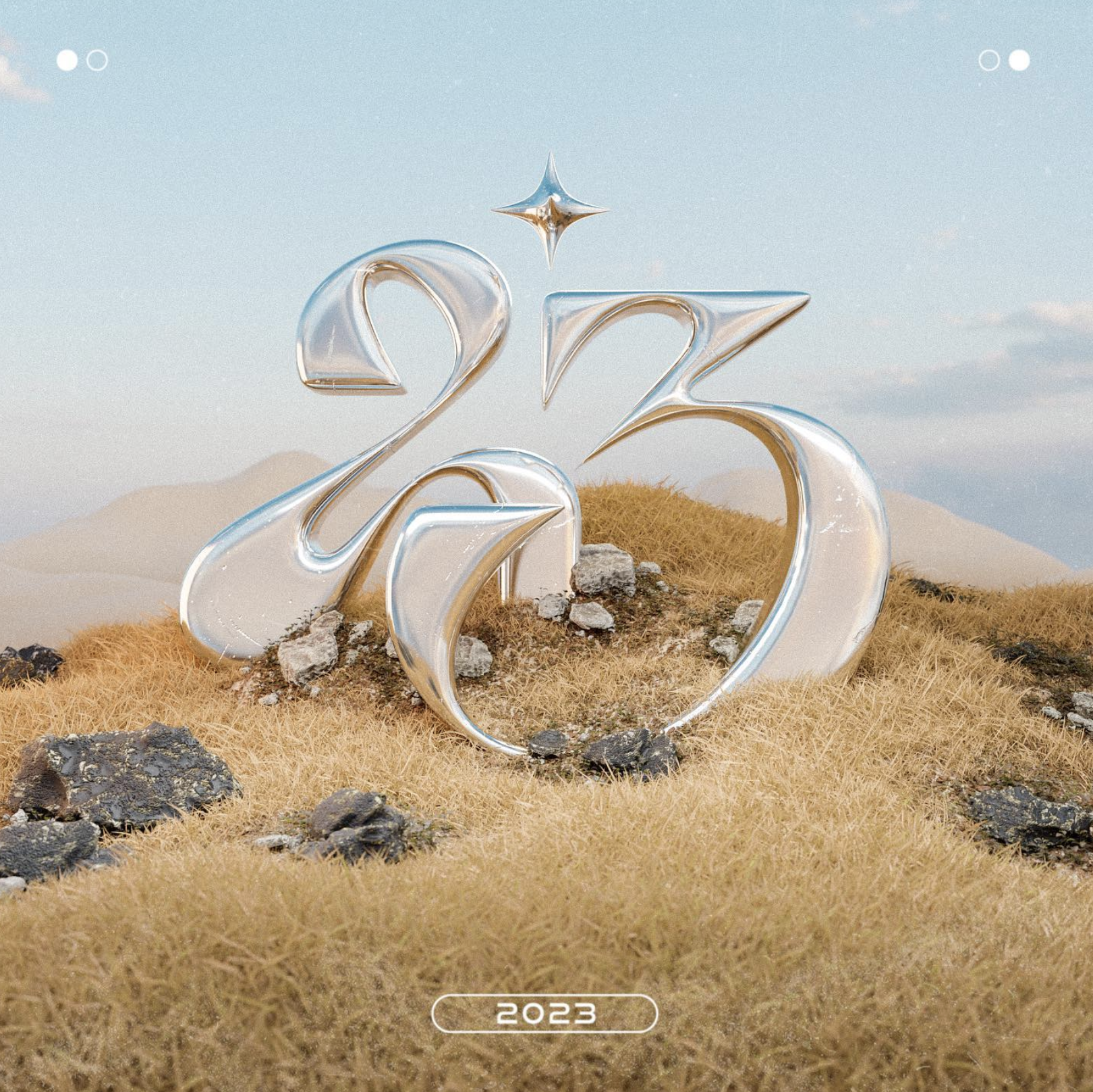
23 by @hatthanan
If you're a fan of modern, futuristic design, then you need to check out the work of Hatthanan, a graphic designer based in Melbourne, Victoria. He's quickly making a name for himself in the design world with his innovative approach to typography and 3D art.
One of the things that sets Hatthanan's work apart is his use of chrome typography. He's not afraid to use bold, shiny letters that jump off the page, giving his designs a sleek, high-tech feel. This approach is particularly effective in his posters and advertisements, where the chrome typography serves to grab the viewer's attention and convey a sense of cutting-edge innovation.
But Hatthanan's use of typography is just one aspect of his futuristic design style. He also incorporates a lot of 3D art and renders into his work, giving it a sense of depth and dimensionality that sets it apart from traditional 2D designs. His use of 3D elements, such as chrome spheres and futuristic landscapes, adds an extra layer of interest and intrigue to his work, making it truly stand out.
Hatthanan is a designer to watch. His use of modern, futuristic chrome typography and 3D art/renders sets his work apart, and his ability to create designs that are both visually striking and conceptually impactful is truly impressive.
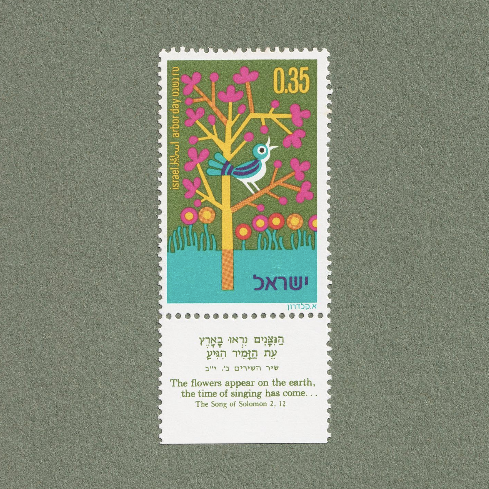
Arbor Day Stamps 1975 by Asher Kaldero
Kalderon's design style was influenced by post World War II European design. His works were characterized by the use of bold colors and rounded lines, which were also expressed in the typography he created.
In 1954 he worked in a private advertising agency. Between 1955 and 1960, he served as a civilian employee of the IDF in the headquarters of the Chief Engineering Officer, and in 1960 he established an independent studio in Tel Aviv-Jaffa, and over the years designed over 60 stamps for the Israeli Philatelic Service. Among his clients are government companies, as well as commercial companies, for whom he has created a variety of designer product from symbols, posters and packaging, to the design of a comprehensive company image/logo.
I couldn’t find much information about this particular design, but I really enjoy the use of color and how the old printing methods give the noise and the edge color blend that some designers try to imitate in Photoshop nowadays.
Sometimes is good to look back on old designs and get inspired to create new things.
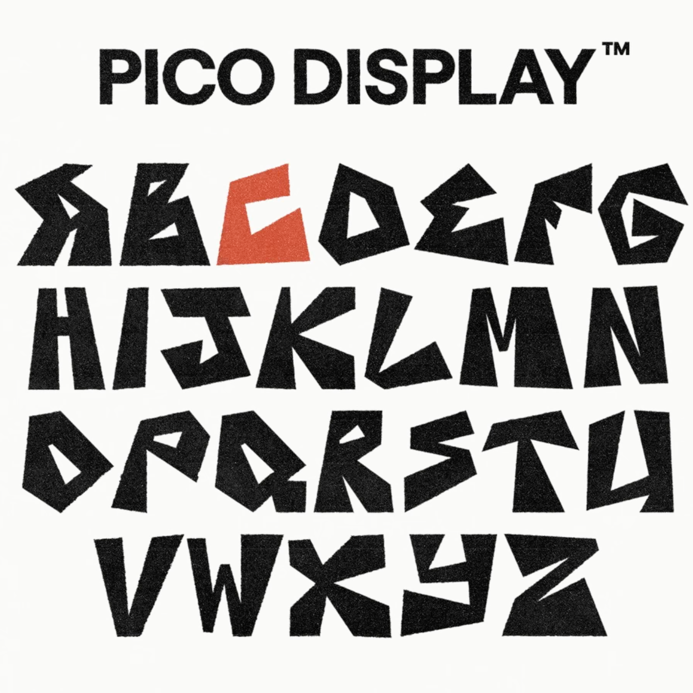
PICO DISPLAY by @manasseto
Manas Trivedi is a hand-lettering and typography specialist from Dublin, Ireland.
As Manas puts it PICO DISPLAY is “a display typeface inspired by Saul Bass' classic design work and Stussy. It is made up of uneven lines that look chaotic yet have an underlying rule of thirds grid. Made up of simple timeless shapes that will not go out of style. This is a high contrast typeface that will definitely grab attention.”
One of the things I love about PICO DISPLAY is its uneven lines. The font looks almost as if it's been hand-drawn, giving it a sense of movement and energy that is really engaging. But, despite its chaotic appearance, the font is actually based on a rule of thirds grid, which provides a sense of structure and balance. This combination of chaos and order is what makes the font so visually interesting.
PICO DISPLAY is a typeface that is well worth checking out for any designer looking for a font that is visually striking, versatile, and timeless. Its unique combination of uneven lines, a rule of thirds grid, and simple geometric shapes makes it a standout choice for any design project.
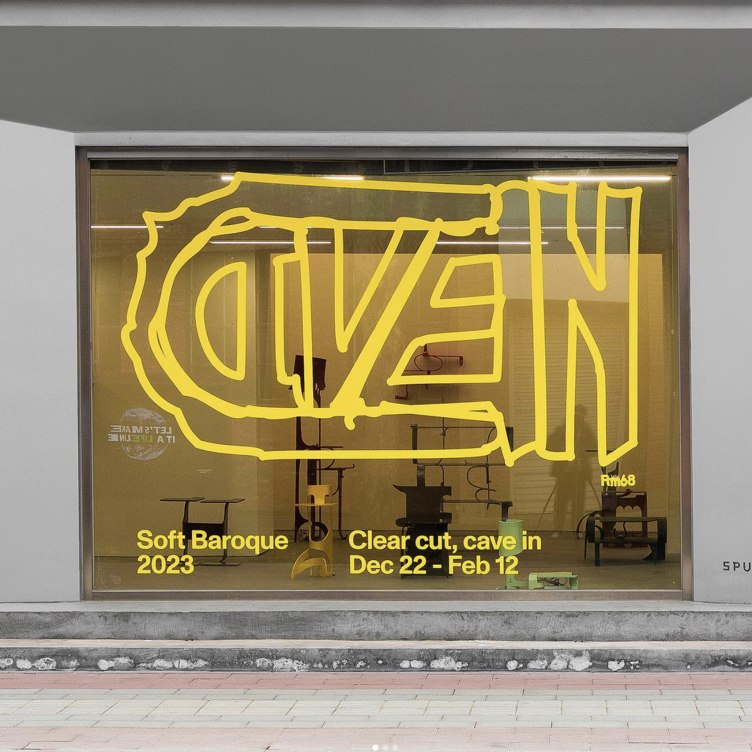
Show Identity Design for @soft_baroque by @workbyworks
Workbyworks is a multidisciplinary design studio based in New York and Shanghai, founded by Han Gao and Wenbo Yi. Working with clients around the world, they provide creative direction, branding, visual identities, packaging, website and book design.
When it comes to shop window design, the Show Identity Design for Soft Baroque by workbyworks is truly a standout example. This design is bold, striking and truly memorable and it showcases a unique approach that I truly love.
One of the things that I appreciate about this design is its use of scribbled lines. The lines add a playful and hand-drawn feel to the design, which is a nice contrast to the more polished and refined look that is often seen in shop window designs.
Another aspect that I really enjoy is the use of a single color: yellow. It's a bold choice, but it works so well in this design. The yellow color is bright and attention-grabbing, which is important in a shop window design where the goal is to draw in customers. At the same time, the simplicity of using just one color makes the design feel modern and minimalistic.
The use of a single color also adds to the sense of unity and cohesiveness in the design, which is important when it comes to branding and creating a memorable visual identity.
The overall approach of this design is minimalistic, but it still manages to grab attention and make a statement. This is a testament to the skill of the designer, who was able to create a design that is both impactful and simple.
And that concludes our top 5 designs of the week. I hope you were inspired by this week's selections and found them as creative and enjoyable as I did.
From the playful and colorful illustrations of Asher Kaldero, to the bold visual identity by workbyworks, to the striking and experimental typography of Ronald Lubega, Manas Trivedi or Hatthanan, these designs showcase the breadth and depth of creativity in the design community.
I believe that one of the most important aspects of being a designer is to keep pushing the boundaries of what is possible and to always be open to new ideas and experimentation. These top five designs of the week certainly embody that spirit, and I'm sure they will inspire you to think differently about your own design work.
I can't wait to see what next week's top 5 designs have in store, and I look forward to sharing them with you. Until then, keep creating and experimenting, and who knows, maybe your designs will be featured in next week's list.