Designs of the Week
(16 Jan ─ 22 Jan)
by Teodor Moisescu Design inspiration can come from the most unexpected places. Whether it's a clever ad campaign, a beautifully designed packaging, or a simple logo, the best designs have a way of catching our eye and making an impact. In this article, I will be sharing my top 5 designs of the week that have caught my attention and left a lasting impression. From striking typography to bold colors and clever illustrations, these designs are sure to inspire and delight. So, without further delay, let's dive into the world of beautiful design.
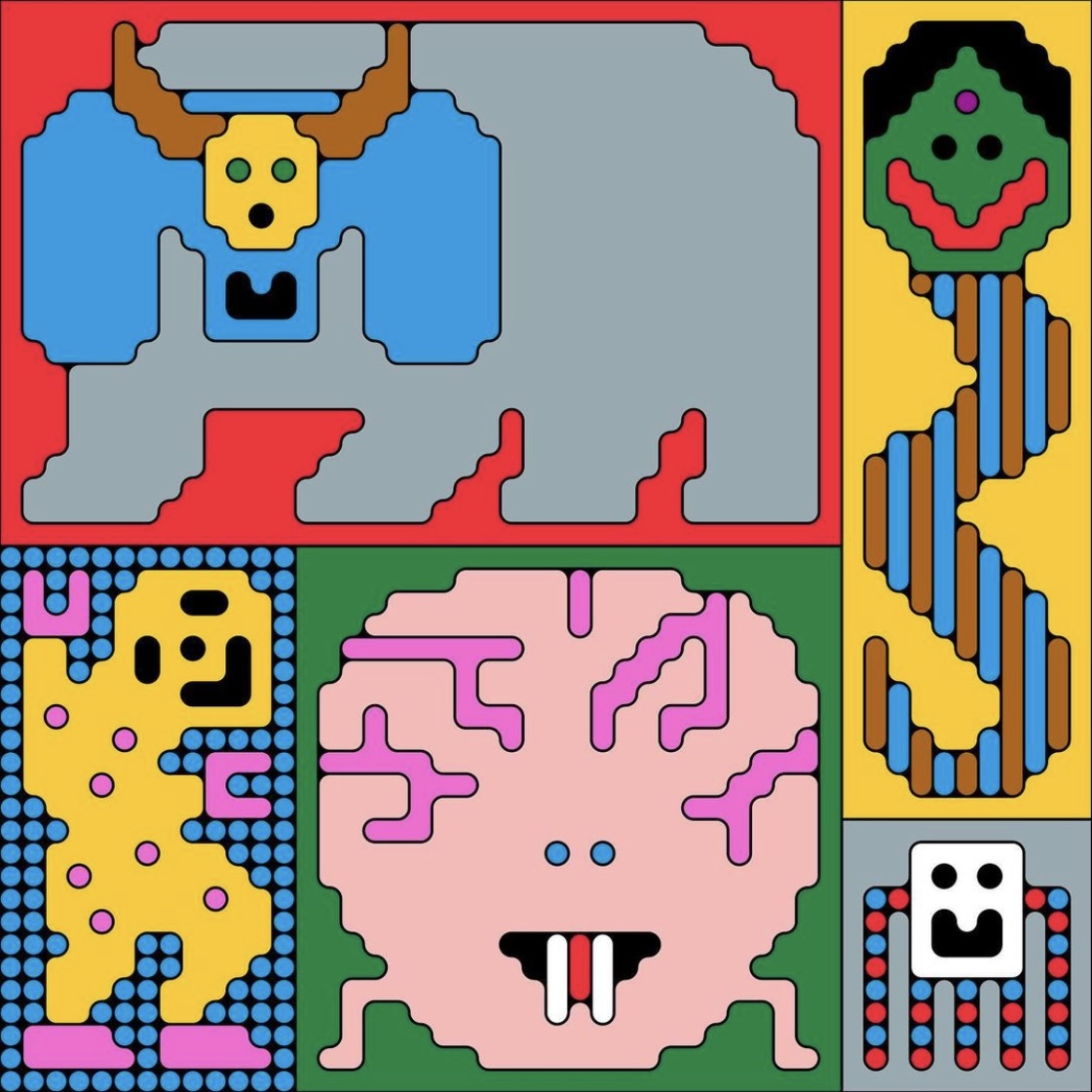
Unnamed by @monsieurmathieulabrecque
Pixel art is often associated with low-resolution images and 8-bit video games, but it is so much more than that. It's a style of illustration that offers a wide range of possibilities and has seen a resurgence in recent years.
Montreal-based graphic designer, Mathieu Labrecque, finds inspiration and creative freedom in the structured constraints of drawing within a grid.
He believes that the framework of a grid can make it feel more like a planned design and the mechanical, mathematical and puzzle-solving aspect of creating in this style is very fun.
Using rounded corners, outlines and repeating, kaleidoscopic patterns, Mathieu’s work presents a unique take on the retro aesthetic and creates his own unique style.
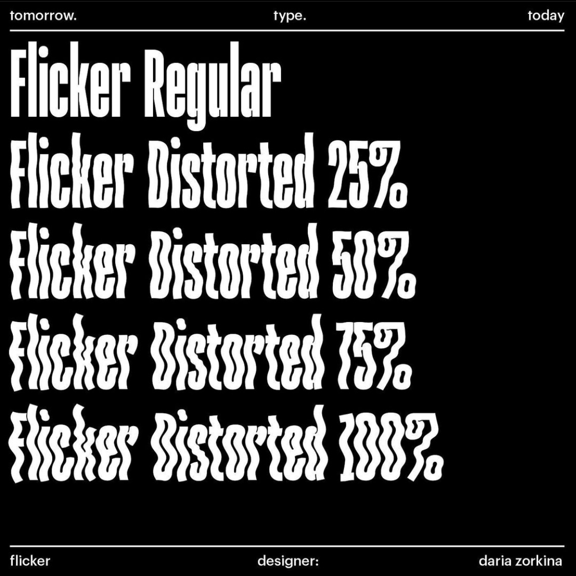
@tomorrow.type.today — “Flicker” by Daria Zorkina
Daria Zorkina is a graphic and type designer based in Moscow. Daria is an enthusiastic calligrapher. To find fresh design solutions she combines her understanding of the writing process with technological approach. Her scope of interests also includes linguistics and foreign languages, which feeds her experiments with non-Latin writing systems, such as Arabic and Greek. Daria is using her experience to develop logos, lettering and design murals.
Flicker is a unique typeface that is based on the concept of hypertrophy of optical compensators in stem joints. This results in a narrow letter proportions and a heavy, compact style. The letters can be arranged into a solid block, making it a great choice for decorative typography. The uppercase and lowercase letters are similar in appearance and the ascenders are longer than the descenders.
The typeface also includes a decorative version that features distorted letters that resemble ripples in water, which is where the name Flicker comes from. The regular and decorative fonts work well together and thanks to the variable nature of the typeface, users can choose the level of distortion that works best for their project. The Flicker typeface includes stylistic alternates, fractions, indexes, case-sensitive punctuation, extended Cyrillics and Latin characters.
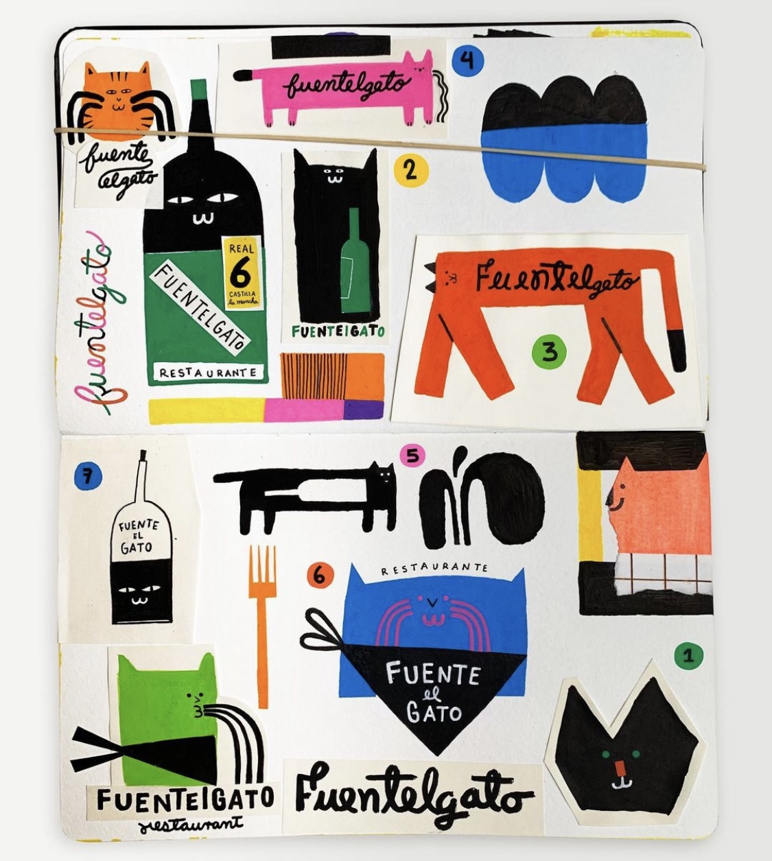
Sketchbook 3 by @miguel_monkc
Miguel Monkc an advertising and editorial illustrator based in Valencia, Spain. He self describes his work as bold, colorful, straightforward, funny and whimsical.
When it comes to design, the final product is not the only important aspect, but the process that leads to it is just as crucial. This week, I've decided to include a sketch in my top 5 designs of the week as a reminder of the design process and its significance.
A sketch is a rough representation of an idea, often done quickly and without much detail. It's a crucial step in the design process as it allows designers to explore different concepts, refine their ideas, and experiment with different composition and layouts. Sketches are also a great way to communicate ideas to clients or collaborators, allowing them to visualize the final product before it's fully realized.
The sketch I've included in this week's top 5 is not just any sketch, it is a piece that caught my attention for its creative drawings and interesting handwriting. This feels like a page from the designer's diary. It's a reminder that behind every polished design, there are countless sketches and iterations that lead to the final product.
Including a sketch in my top 5 designs of the week is a reminder that the design process is just as important as the final product. It highlights the value of experimentation, exploration, and iteration in the design process. So, next time you look at a polished design, remember that there was a sketch behind it, and the designer's journey to get to that final product was just as important as the final outcome.
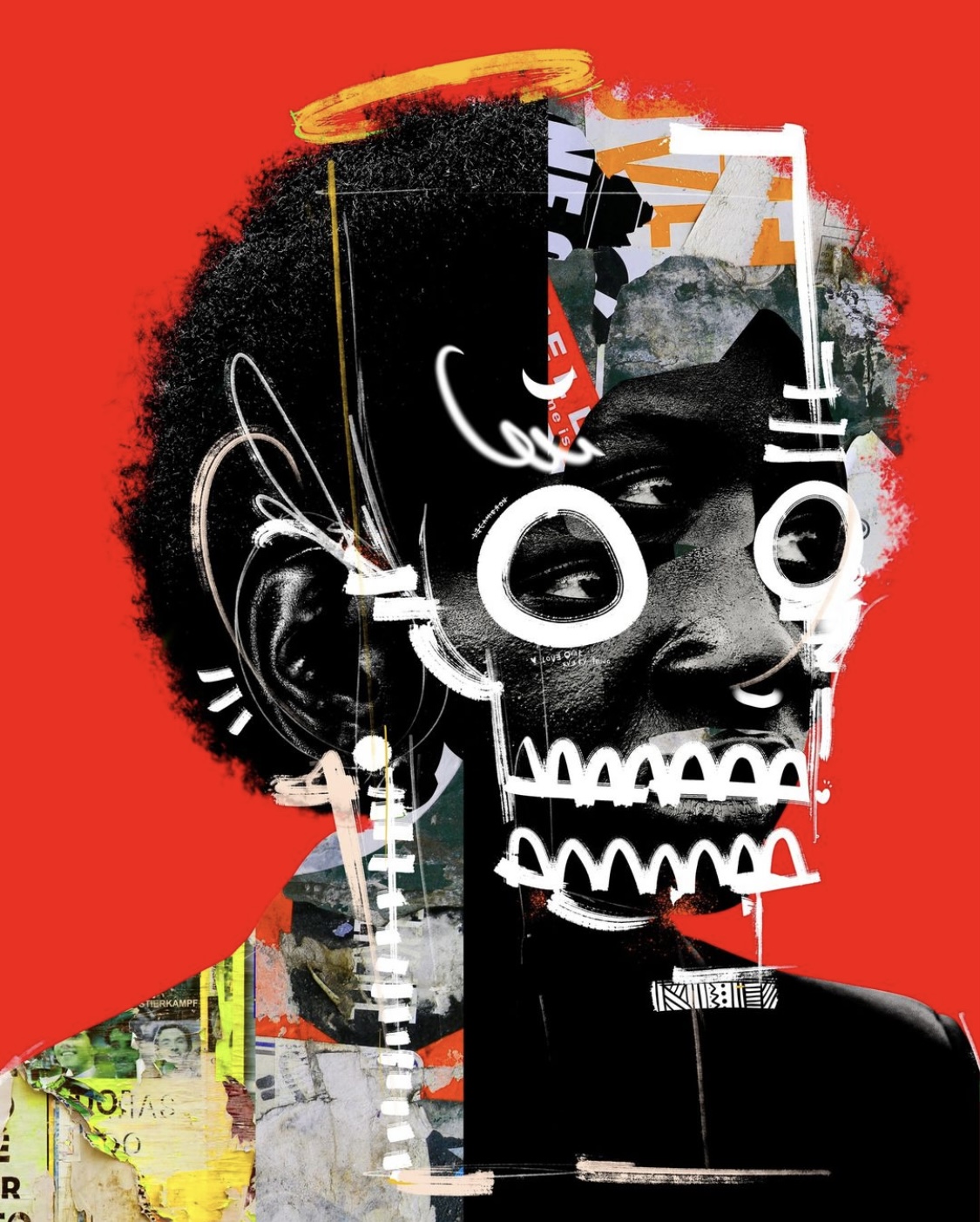
Decameron - Light by @mboa.art
Cameroonian graphic artist Maxime Manga has become the illustration go-to for some of the biggest names on the planet: Adidas, The New Yorker, Adobe etc. His motto is "using diversity to create uniqueness." It's why his art often features portraits from underrepresented communities, in a digital collage of geometric shapes and stardust shades.
It’s this self-described ‘Afrofuturistic’ style that has enabled Maxime to carve out a niche in a contemporary art form.
He has developed a personal style that focuses on experimental photocollage, self-described as ‘Afrofuturistic’, and a distinctive patchwork aesthetic. He combines portraits with analog elements in Photoshop to create unique works.
He finds inspiration in the vast networks of social media and the vibrant creative scene of his hometown Yaoundé. Maxime says thet he knows when a work is finished through instinct, and when he is happy with it, it is complete.
Maxime’s works are a true representation for the African design scene and a source of inspiration for the world.
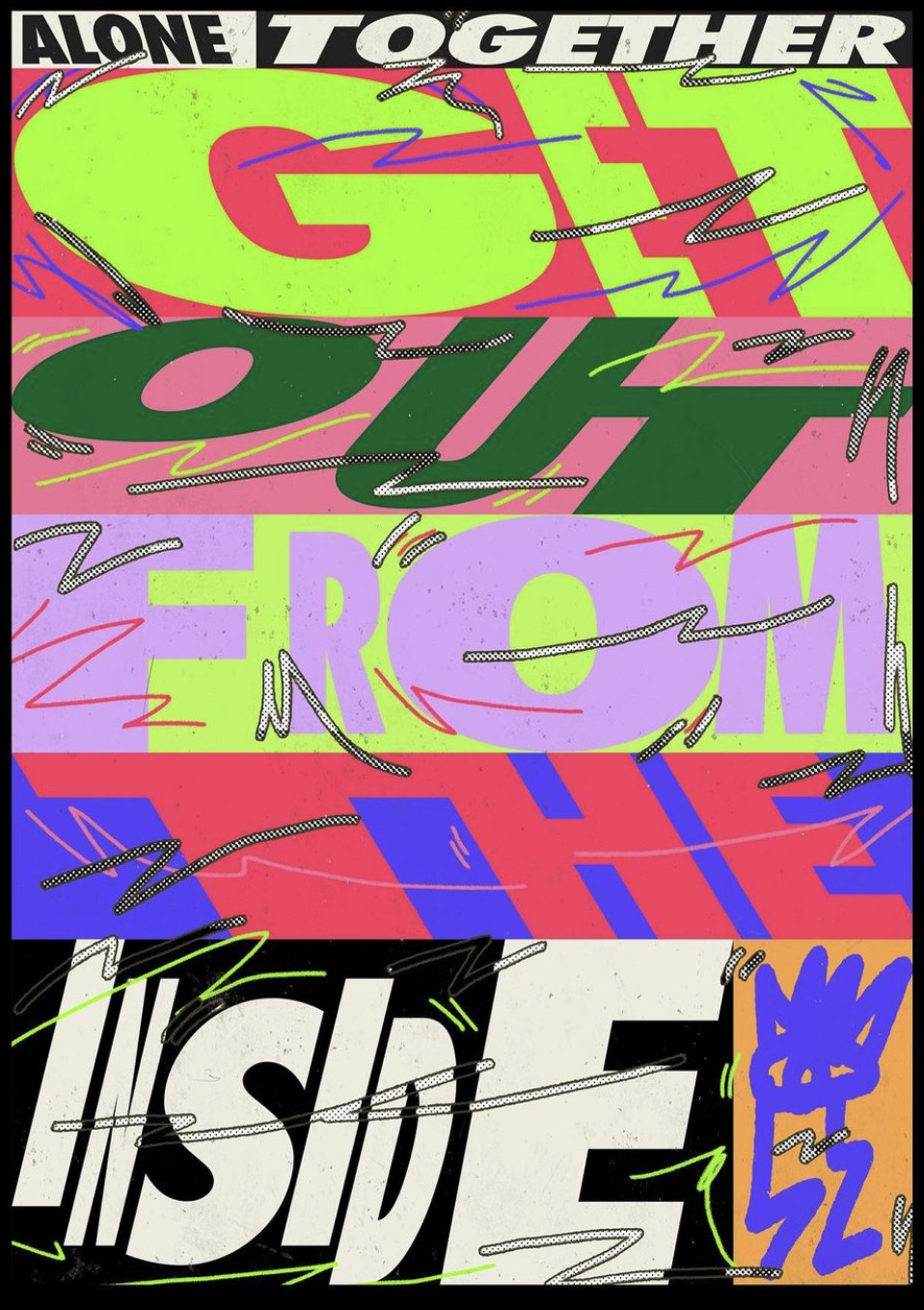
Get Out from the inside by @krisandrewsmall
Based in Sydney, Kris Andrew Small’s work is a joyful explosion of colour, typography, pattern, and collage. He often takes societal issues and channels them through loud and abstract visuals. That’s not to say his work is heavy, though, in fact, his portfolio is one of utter exuberance. This distinctive merging of techniques and themes features on any number of mediums, from posters to campaigns, packaging, zines and everything in between, and has seen Kris collaborate with clients including Nike, Apple, Dazed, Adidas and more. He’s also exhibited internationally at institutions like the V&A in Dundee and MAD in The Lourve, Paris.
Kris is known for his unique style, which combines typography with abstract visuals and collaged photos. He approaches typography in a free-form way, hand-drawing letters and treating them as textures rather than adhering to traditional rules.
This fusion of graphic design and illustration is what sets Kris apart and allows him to redefine the boundaries of these disciplines. He embraces self-expression and fluidity, constantly exploring new and innovative mediums to showcase his work. Kris's creative ambition knows no bounds, and he can be seen working on various canvases such as shoes, cars, and watches.
I love how he manages to create a balance in this chaotic style and the way he uses bold colors, experimental type and different textures. Kris is a talented graphic designer whose unique style sets him apart from the rest.
I can say that this week’s top 5 was very diverse refelcting the design community's creativity, ranging from Mathieu's playful and colorful illustrations, to Miguel and Maxime's bold visuals, to Kriss and Daria's striking typography, we all have something to learn and should always experiment.
This different styles can help a designer develop their own unique aesthetic and voice. It can also be a source of inspiration and creativity. A graphic designer can learn a variety of skills and techniques from studying different design styles, including color theory, typography, composition, and layout. They can also learn about the historical and cultural context of different design movements, which can inform their own work and make it more meaningful and impactful.
I think I can summaries this weeks list in two words: diversity and learning. Tune in next week for a new list and more design.